05:00
Week 5 Starter File

Basic Visualizations
The following sections of the book (R for Data Science) used for the first portion of the course are included in the first week:
Link to other resources
Internal help: posit support
External help: stackoverflow
Additional materials: posit resources
Cheat Sheets: posit cheat sheets
Getting Inspired: R charts examples
While I use the book as a reference the materials provided to you are custom made and include more activities and resources.
If you understand the materials covered in this document there is no need to refer to other resources.
If you have any troubles with the materials don’t hesitate to contact me or check the above resources.
Our Data Science Model
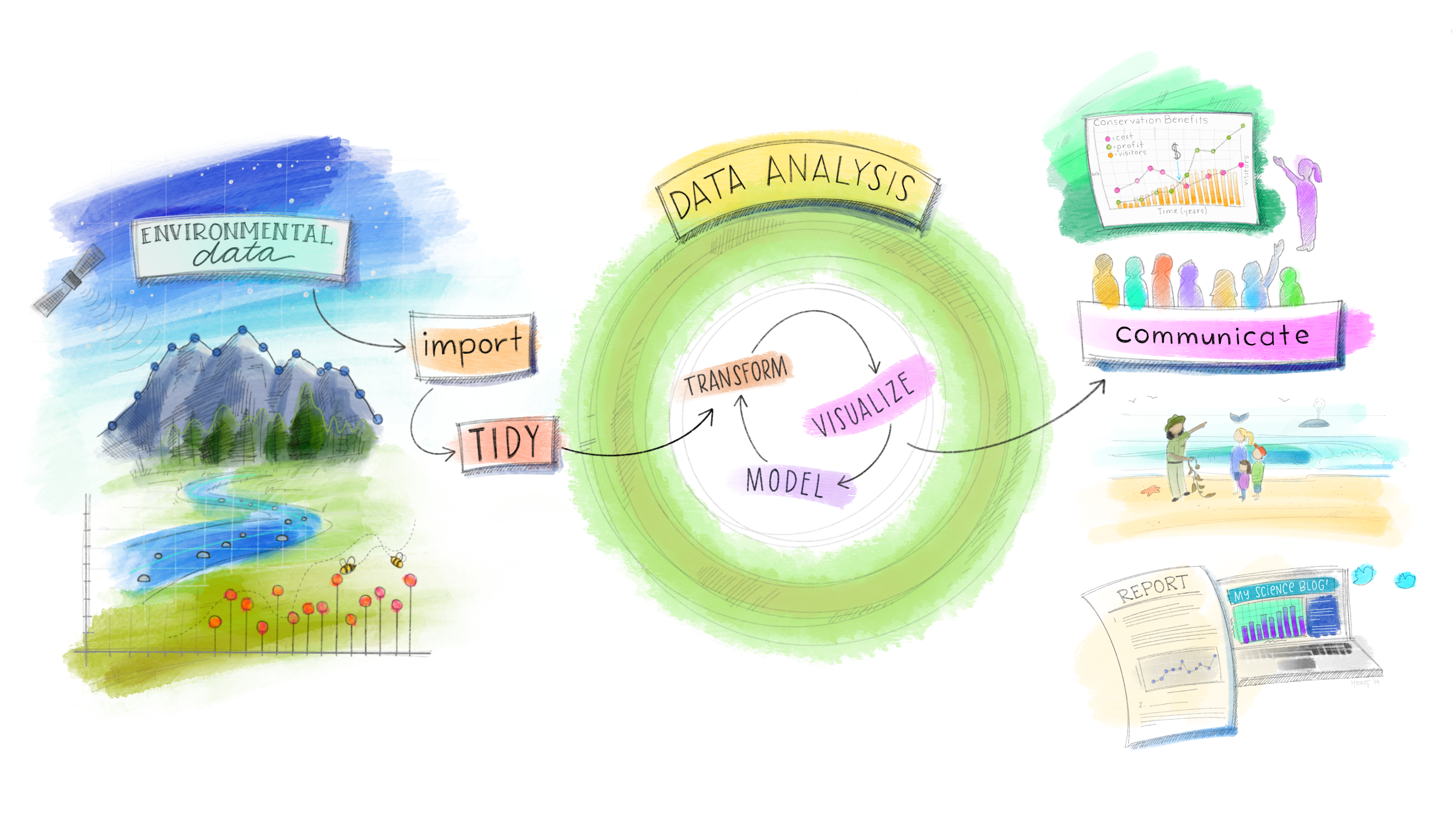
After diving into data manipulation—where we’ve arranged, filtered, selected, mutated, grouped, and summarized our data—it’s time to move on to the next stage: visualizations! While manipulation is about preparing and transforming data to avoid the classic ‘garbage in, garbage out’ scenario, it’s also where we begin to develop questions about our data. Visualizations, on the other hand, are about answering those questions in a way that makes patterns, trends, and insights clear to both you and a broader audience.
In this phase, we’ll focus on the ggplot2 package, a cornerstone of the tidyverse package. With ggplot2, we can turn raw numbers into compelling visual stories, effortlessly communicating complex data. Whether we’re examining distributions, relationships, rankings, or trends over time, visualization helps us see what the data is truly saying.
Throughout this class, I’ll use the terms chart, plot, and graph interchangeably. While they may take different forms, they all share the same purpose: transforming data into something meaningful and impactful. Together, we’ll build on our data manipulation skills to create stunning visual representations that not only inform but also inspire.
Load packages
This is a critical task:
Every time you open a new R session you will need to load the packages.
Failing to do so will incur in the most common errors among beginners (e.g., ” could not find function ‘x’ ” or “object ‘y’ not found”).
So please always remember to load your packages by running the
libraryfunction for each package you will use in that specific session 🤝
We will use the mpg data frame available in the ggplot2 package. ggplot2 is always loaded if you load the tidyverse package.
What is the first step when you start working with a new dataset?
Getting to know the data
It is also possible to get more info about the dataset by running the below code:
Now that we got to know the data more it is time to begin our exploratory analysis using visualizations!!!
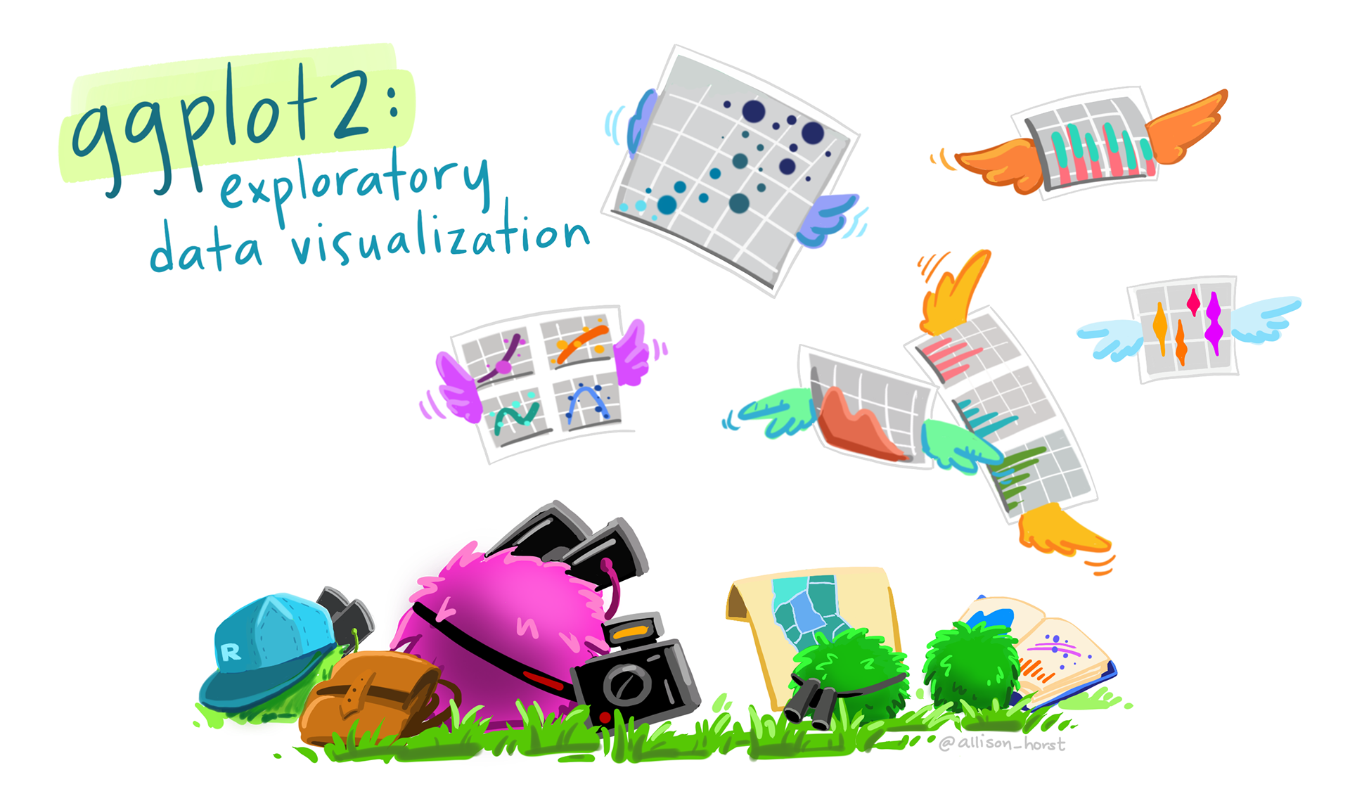
Creating your first ggplot chart
Creating a data visualization with ggplot2 is a lot like painting. You start with a blank canvas, and just like an artist, you add layers one step at a time until the picture takes shape. At first, there’s nothing there but potential—a canvas waiting to be filled.
Each step in the process, whether it’s deciding on the chart type or choosing the colors and elements, is like adding layers of paint to a canvas. You gradually build up details, adding depth and clarity to your creation. Just as a painter chooses which areas to highlight or leave in shadow, we use tools in ggplot to emphasize different aspects of the data.
By the end, what started as a blank space becomes a visual story—a piece of art that not only looks good but also communicates meaning, helping others understand the data in a way that numbers alone can’t. Enough with the theory.. let’s see how ggplot2 works in practice:

With ggplot2, you always begin your plot with:
- the function ggplot() creates a coordinate system, your empty canvas, that you can add layers to.
- the first argument we add to our ggplot() chart is the dataset to use in the graph. While the chart is still empty now the data are loaded in the background and ready to be visualized.
- then we need to map what variables we want to visualize on our axes. So ggplot(data = mpg, mapping= aes(y=manufacturer)). While the chart core of the chart is still empty, now the axes and their scales are visible.
- The graph takes shape by choosing the type of chart you want to create. In this layer, we add the geom (short for geometric object or representation), which determines the visual structure/shape of the chart. For example, using geom_bar() adds a layer of bars, creating a bar plot. While geom_point() adds a layer of points to your plot, which creates a scatterplot.
Let’s create a few more charts to visually explore our new dataset:
Let’s now check the distribution of highway fuel efficiency among the cars in this dataset:
Note
Notice that I have used geom_histogram and not geom_bar in this case. We will learn more about which chart is the most appropriate given the column data type later in this class.
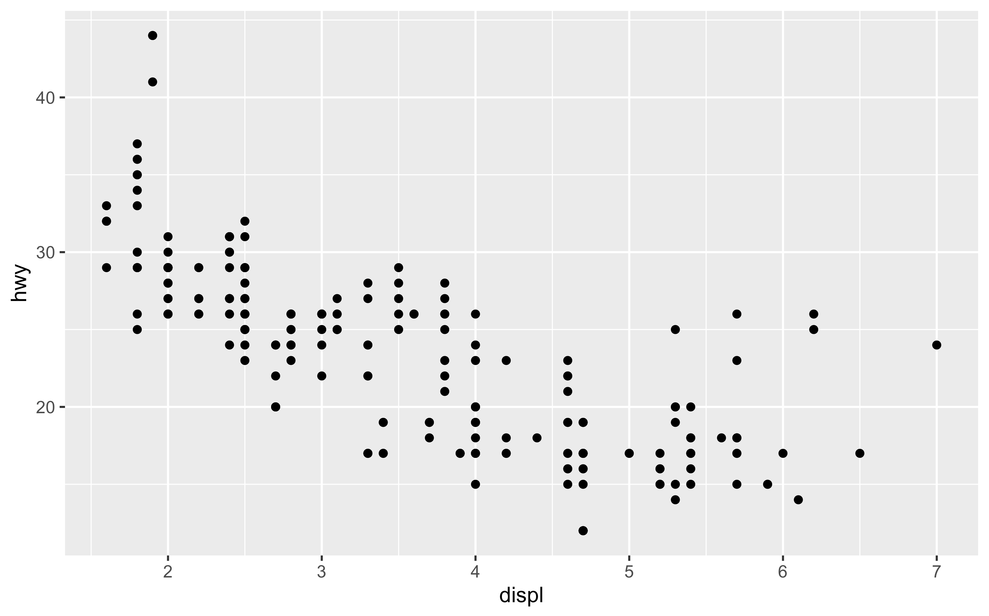
Let’s now check the relation between engine size and highway fuel efficiency. Any surprise?
Cars with big engines seem to use more fuel. But… there are a small number of cars with large engine that still have pretty good highway fuel efficiency.
Create a histogram chart that show the distribution of the city fuel efficiency (cty) variable
Create a scatterplot that shows the relationship between engine size and city fuel efficiency
Activity 1 (a & b in class c & d at home): Basic Charts - 5 minutes:
[Write code just below each instruction; finally use MS Teams R - Forum channel for help on the in class activities/homework or if you have other questions]
Create a bar chart for the class variable.
Create a scatterplot between the highway fuel efficiency and number of cylinders.
What do you notice?
Create a boxplot that show the distribution of the city fuel efficiency (cty) variable.
Create a bar chart for the fl variable.
Knowledge Check 1
Question: What geom was used in the chart above?
- answer 1: geom_bar,
- answer 2: geom_point,
- answer 3: geom_boxplot,
- answer 4: geom_plot
Chart template: starting point for future charts
So, to summarize in ggplot2 the charts follow the below template:
Important
ggplot(data = <DATA>, mapping = aes(<MAPPINGS>)) + <GEOM_FUNCTION>()
But at this point you are probably wondering what is the purpose of the aes function and mapping argument.
Each geom function in ggplot2 takes a mapping argument. This defines how variables in your dataset are mapped to visual properties (e.g., axes). The mapping argument is always paired with aes() [aesthetic] function, and the x and y arguments of aes() specify which variables to map to the x and y axes. ggplot2 looks for the mapped variables in the data argument, in this case, the mpg dataset.
Let’s learn how to complete and extend this template to make different types of graphs. We will begin with the <MAPPINGS> component.
Aesthetic mappings beyond axis
In the first scatterplot (“original chart” below) some cars were outside the linear trend. How do you explain them? Let’s hypothesize that the cars are hybrids (larger engine but still pretty good mpg). One way to test this hypothesis is to look at the class variable for each car. The class variable of the mpg dataset classifies cars into groups such as compact, midsize, and SUV. If the outlying points are hybrids, they should be classified as compact cars or, perhaps, subcompact cars (old dataset those classes were the only offering an hybrid engine at that time). How can we include the class variable in our original chart?
You can add a third variable, like class, to a two dimensional scatterplot by mapping it to an aesthetic. Again aesthetics are visual properties of the objects in your plot. Aesthetics include things like:
color/fill,
size,
alpha (transparency)
shape.
Warning
Depending on the geom you are using more aesthetics might be available. However, please remember that not all the aesthetics work well with every geom.
Let’s compare the above aesthetics and see which one is best to show the impact of the class variable on the relationship between hwy and displ:
Just for reference I am putting the original chart here. This way it will be easier to see the impact of mapping the class variable to the different aesthetics.
Now, we want to assign a different color to the points based on their class value.
This is a beautiful and very informative chart and we just got started!
Next we want to map class to the size aesthetic. In this case, the size of each point would reveal the cars’ class.
We get a warning here, because mapping an non-ordered variable (categorical) to an ordered aesthetic (size) is not a good idea aka you should use it with numerical variables. Pay attention to this warnings they are not errors but provide instructions/tips on how to improve your charts! What happen if you assign size to cyl?
So far, we have mapped class to color and size but we could map class also to the alpha aesthetic, which controls the transparency of the points. Let’s see what happens:
Finally, let’s map class to the shape aesthetic, which controls the shape of the points.
What happened to the SUVs? ggplot2 will only use six shapes at a time. By default, additional groups will not be plotted when you use the shape aesthetic. So, you are losing data.
In the case above, the color aesthetic is the best choice because it clearly reveals that the interesting points (big engine but good hwy) are two-seater cars. These cars can’t be hybrids (my dead wrong assumption), and are, in fact, sports cars! Sports cars have large engines like SUVs and pickup trucks, but small bodies like midsize and compact cars, which improves their gas mileage on the highway.
Important
Creating charts is, at its core, an act of design. Never settle for the first chart you create—always strive to improve it, both in terms of visual appeal and effectiveness in conveying the information. Ask yourself whether the chosen chart type (geom) is truly the best way to represent the data, keeping your objective in mind.
Charts are essential tools for telling a compelling story with your data. If you don’t put forward your best visual representation, your story will fall short, making it harder to capture and maintain your audience’s attention.
Let’s see now a few other examples of how mapping to one of the above aesthetics can improve/not improve your chart and enable you to convey/not convey more information:
Box plots are better than bar plot in identifying outliers. In general, to map an aesthetic to a variable, associate the name of the aesthetic to the name of the variable inside aes(). ggplot2 will automatically assign a unique level of the aesthetic (here a unique color) to each unique value of the variable, a process known as scaling. ggplot2 will also add a legend that explains which levels correspond to which values.
I see chart similar to this one in real life all the time.. what is wrong with it? what can you do to make it better while still using the same variables?
I see chart similar to this one in real life all the time.. what is wrong with it? what can you do to make it better while still using the same variables?
I see chart similar to this one in real life all the time.. what is wrong with it? what can you do to make it better while still using the same variables?
Activity 2: Three Variables Charts: Let’s test the different aesthetics - 7 minutes:
[Write code just below each instruction; finally use MS Teams R - Forum channel for help on the in class activities/homework or if you have other questions]
Create a bar plot of the manufacturers (x) assign a different color to each value of the cars’ transmission
Create a scatterplot between the highway fuel efficiency (y) and engine size (x) assign a different size to each value of the cars’ cyl.
Create a boxplot of the class (y) and cty (x) assign a different transparency to the cty variable.
Is this is a good chart? What would you change to improve it?
Create a scatterplot between the city fuel efficiency (y) and number of cylinders (x) assign a different shape to each drv
How to chose the right chart?
Before I mentioned that creating beautiful and insightful visualizations is an art of design. For some people, creating visualizations is very natural and intuitive… for the rest of us, it is better to add some guidance.
Choosing the right chart depends mainly on two elements:
The data type of the columns: Is the data numerical (e.g., continuous numbers like age, income), categorical (e.g., names, categories, groups), or a combination of both?
The objective of the chart: What are you trying to convey with your chart? Do you want to show how data is distributed (distribution charts), explore relationships (correlation charts), rank items (ranking charts), or track changes over time (evolution charts)?
Please refer to the below website anytime you wonder what is the best way to visualize your data? or what is the most effective geom for the task ?
Through this lens, let’s explore the possible charts based on these elements. Keep in mind, this is by no means an exhaustive list—there are too many geoms to cover them all. Instead, this serves as a starting point, introducing you to the most common charts and guiding you through the fascinating world of data visualization in R. Now, let’s dive into each objective by exploring specific chart types:
Distribution Charts
- What is a distribution chart?
A distribution chart shows how values in a dataset are spread out or clustered. It highlights the range of data, concentration of data points, and whether data tends to be skewed towards certain values. Common distribution charts include histograms, boxplots, violin and density plots.
- When to use it?
Use a distribution chart when you want to understand how your data is distributed across a range of values. It’s especially useful when you’re exploring data (numerical column/s) to identify outliers, normality, skewness, or patterns in the spread. If you’re interested in seeing how many data points fall within certain intervals or the frequency of occurrences, this type of chart is ideal.
- Why to use it?
Distribution charts help in understanding the spread and shape of your data. They give quick insights into patterns such as:
Are most values clustered around a central point (normal distribution)?
Is there a long tail of rare events?
Are there outliers that could skew the results?
Please see below some distribution charts examples:
Important
As you can see from the above charts geom_histogram and geom_density are great to show distribution of a numerical column (hwy). Moreover, we can use the fill aesthetic to show how the drv column affect the distribution of hwy. The histogram chart will produce a count on the y axis while the density plot will show the density on the y axis.
On the other end if you want to show the distribution of a numerical variable in relation to a categorical variable (on a separate axis) the best option you have is to pick between geom_boxplot and geom_violin. If you carefully compare them you will notice that while the shape of the charts is very similar, they convey different information better. If your goal is to provide an indication of outliers and show the median value then geom_boxplot is the best choice. If the object is instead just show the distribution the violin chart will be more effective.
Correlation Charts
- What is a correlation chart?
A correlation chart is used to examine the relationship between two (or more) numerical variables. The most common correlation chart is a scatter plot, but smoothing lines, 2d charts, heatmaps and correlograms are also used to visualize correlations.
- When to use it?
When you want to show whether two variables are related (e.g., does height increase with age?). It is particularly helpful when investigating relationships or patterns of association between variables. However, remember that correlation does not imply causation—just because two variables are related doesn’t mean one causes the other.
- Why to use it?
Correlation charts help in understanding relationships between variables. They answer questions like:
Does an increase in one variable correspond to an increase or decrease in another (positive or negative correlation)?
Are the variables independent, or do they follow a pattern?
Please see below some correlation charts examples:
Important
As you can see scatterplot and smoothing line plot are a very effective way to show relationships among variables. They are probably the most effective way to identify if there is a relationship and what is its direction.
2d plots are valid alternative is certain circumstances when a lot of data overlap. However, I do prefer simplicity over complexity when it comes to visualizations. The question remain the same, what is the best chart to convey the information I want to share with my audience?
Ranking Charts
- What is a ranking chart?
A ranking chart displays how different categories (categorical variables) compare in terms of a certain measure. Bar charts, lollipop charts, and dot plots are often used to visualize rankings, showing which categories are higher or lower based on a particular value.
- When to use it?
Use a ranking chart when you want to compare the performance of categories, items, or groups (e.g., ranking companies by revenue, countries by population). It’s helpful when you’re presenting a clear order of items and want to make it easy to see the best, worst, or middle performers.
- Why to use it?
Ranking charts offer a clear way to compare values across different categories. They help answer questions like:
Which category ranks the highest or lowest?
What are the differences between the top performers and the rest?
Please see below some ranking charts examples:
Important
Ranking charts are extremely important when you are trying to visualize categorical variables. Just like for histogram, if you have only one variable, geom_bar will automatically put the count of the observations on the y axis. On the contrary if you want to show the categorical variable with respect to a numerical variable, you must use geom_col. Geom_col will produce the count of the numerical variable on the opposite axis of your categorical variable.
Evolution Charts
- What is an evolution chart?
An evolution chart (also called a time series chart) shows how a variable changes over time. Line charts are most commonly used to visualize trends, but area charts can also serve this purpose.
- When to use it?
Use an evolution chart when you’re interested in how data evolves over time (e.g., monthly sales figures, stock prices, temperature changes). If you want to highlight trends, patterns, seasonality, or fluctuations over a period, evolution charts are your best option.
- Why to use it?
Evolution charts help in visualizing trends and changes over time. They can answer questions like:
Is there an upward or downward trend over time?
Are there any recurring patterns, peaks, or drops?
Did something significant happen at a specific time point that caused a change?
Please see below some evolution charts examples:
Important
Evolution charts can be extremely useful if you are monitoring data overtime. Line charts will draw a line that goes through all your data points. While Area charts will also fill the area below the drawn line. Please note that while you can possible detect the relationship between two variables using line charts, they are not visually as effective as scatterplot and smoothing line chart. I do encourage to use them mainly to visualize over-time trend in your data (thus the line should be drawn chronologically).
Activity 3: Choosing the right chart for the job - 7 minutes:
[Write code just below each instruction; finally use MS Teams R - Forum channel for help on the in class activities/homework or if you have other questions]
Note
In completing the below activities feel free to pick the variable/s that you prefer. However, make sure to chose an appropriated geom among those demonstrated above. Moreover, always wonder if that is the best way to represent your data; how can you make the chart better? and what did you learn from it?
Create a chart that shows variable/s distribution.
Create a chart that shows variable/s correlation.
Create a chart that shows variable/s evolution.
Create a chart that shows variable/s ranking.
In summary, the key to creating effective visualizations is to choose the right chart based on your data and your objective. Distribution charts help you see how your data spreads, correlation charts help reveal relationships, ranking charts make comparisons easy, and evolution charts show how things change over time. Understanding when and why to use each type will not only improve the clarity of your visualizations but also ensure that your audience can quickly grasp the insights you’re trying to share.
Warning
Please refer to this guide for a list of caveats related to data visualizations

Note
Full code of the above chart is available here